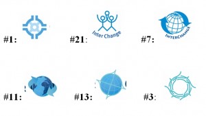
 Many of you will remember when, at the end of 2009, we revealed our logo. The day was a milestone; it had been two years in the making since we had held our initial logo brainstorming session at a meeting in Toronto, Canada.
After that meeting, words to inform the logo were clarified; draft designs were sketched; members contributed ideas from around the world; and many draft images were prepared and rejected. Some of these were too similar to existing logos, others had inappropriate cultural references, and others just didn’t fit.
Through the process we reaffirmed that InterChange stands for solidarity, growth, possibility, continuity, interdependence, equity, and strength. Our logo reflects these, our interconnectedness and our basis in relationships.
Thank you for all your feedback during the process. Together we achieved a better understanding of our purposes and identified a unique symbol to reflect our ideals.

Recent Comments